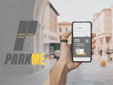
ParkMe
***All images can be clicked to zoom
User Journey Map
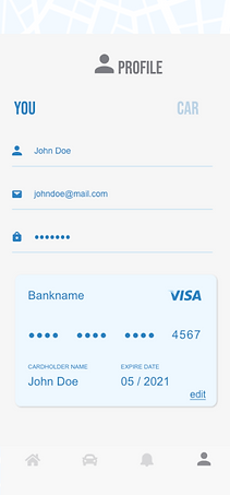
ParkMe is a mobile valet service aimed to alleviate the stress of finding parking in highly populated cities. By way of our mobile app, users can schedule a valet service to park their car for them and pay through the app with digital currency. This will streamline the car valet service and eliminate the need for users to carry cash.
I served as the Project Manager and User Experience Designer of this project. I was joined by 3 other UX Designers and together we developed, tested, and iterated on the idea of ParkMe as a team. As this was a unique idea, we did it independently of any existing company.
We had about two weeks to complete the entire design process for this project. Originally, we brainstormed this app to be a mobile valet that could pick you up from any location. Once we entered the wireframing process, we quickly realized that this was not feasible for our service. We prototyped and iterated on offering “mobile hotspots” to partner with owners of existing parking facilities to offer parking discounts. Using this strategy would eliminate the overhead cost of maintaining a team to verify available parking spots. This also set us apart from one of our direct competitors, Park Mobile, who offers that service.

The main purpose for ParkMe is to alleviate the headache of finding parking in crowded cities. We specifically had cities like Atlanta, Los Angeles, Hollywood, New York City, and Miami in mind when developing this idea. A large number of drivers in cities like these rely on garage or street parking for their work commute and many pay for their daily parking rates. ParkMe would help expedite the parking process and make it easier to pay for their spot.
Just based on our own knowledge and what we would like to see from the service, we developed a proto-persona, Blair Wintercroft. Once we did more in-depth research and surveyed potential users, we developed a user persona, Sarah Lipking, who encompasses the idea of our “ideal user.” Users like Sarah would be individuals between the ages of 18-55 who have valid driver’s licenses and rely on driving themselves to their destinations.
Proto Persona

We then developed a survey and an interview plan and began the research process. I, personally, interviewed two people, as well as boosted the survey out to my friends and family. This gave us a lot of insights that would be helpful in better developing our product with the user’s needs at the core.
Once we had insights from user data, we began creating our sketches and low fidelity prototype. We then user-tested our lo-fi prototype and made iterations based on feedback. We also started developing our UI style guide and ironed out our high fidelity prototype. Once our hi-fi prototype was done, we A/B tested to find which was a more effective design choice. With the insights from the A/B testing, we completed our hi-fi clickable prototype. After much iteration, we had our final prototype completed and we were ready to present!
Affinity Diagram

Sketches


Final Prototype